Greetings! My fellow aspirant. You have chosen this path in the hopes of becoming a renowned web developer someday and would aim to make a stunning website that gives a cutting edge over your competitors. To do that, you need CSS3.
The Expert in anything was once a beginner
Any Expert
If you are reading this post, then I’m sure you are interested in CSS3 as much as I am. Before I begin to say something about it, let’s state the obvious. This post explains some of the features that are introduced in CSS3 and what I think is being used predominantly by web developers. To know about all the new additions in CSS3, please check out this page. If you have just started learning CSS, then I would recommend you to come back after going through this.
CSS3: A Brief
CSS3 is the latest version of CSS and it extends the previous version, CSS2.1. The main advantage of CSS3 is that they have been split into various modules depending on their functionality. This makes it easier for the W3C to test and approve modules that are compatible across various browsers.
But with CSS2.1, it was implemented as a single document and so new features were needed to be tested through the entire document to get approved by the W3C.
Since CSS3 extends its previous version, it not only brings new features to the table but also adds extra functionality to the existing ones. For ex: In CSS2.1, the background-image property supported only one image. But in CSS3, it can support multiple images at once.
Borders
The previous CSS version had many border properties such as border-color, border-width, and border-size. CSS3 introduces two new properties border-radius and border-image.
border-radius allows you to specify rounded corners to an element’s border. It can take up to four values which represent top-left, top-right, bottom-right and bottom-left corners of an element.

border-image allows you to specify images as an element’s border. It is a shorthand property and you can refer this page to know more about it.

Colors
In CSS2.1, colors can be represented either using their names, color-codes or rgb function. CSS3 has introduced three new functions: rgba(), hsl() and hsla().
The “a” in rgba() and hsla() denotes that it can take an extra alpha channel whose value is in the range from 0.0 (fully transparent) to 1.0 (fully opaque).
hsl() refers to hue, saturation, and lightness. Hue is a degree on the color wheel, considering colors arranged in the form of a circle. So, its value ranges from 0 to 360. Saturation and Lightness are percentage values from 0% to 100%.

Background
CSS can be used to change the background of elements. CSS3 has introduced several new properties such as background-clip, background-size, etc.
background-size can be used to change the size of the background image of an element. Earlier, the size of the background image, by default, takes the size of the image itself. The property takes values such as auto, contain, cover and also percentage (or) pixel values.

background-clip defines whether the background image needs to extend to the border of an element or not. It can take the following values: border-box, padding-box, and content-box.

background-image property can now take multiple images.

Gradients
According to Wikipedia, a gradient is :
In computer graphics, a color gradient (sometimes called a color ramp or color progression) specifies a range of position-dependent colors, usually used to fill a region.
In CSS2.1 and earlier versions, a gradient background was achieved by setting a gradient color image as the background. CSS3 has added two new methods linear-gradient and radial-gradient in the background property to set the background color of an element in a gradient fashion.

Text Overflow
A text-overflow
Both of the following properties are required for text-overflow:
- white-space: nowrap;
- overflow: hidden;

Transitions
A transition, in CSS, refers to a change in the nature or state of an element such as color, position, shape, size, etc. over a period of time. CSS3 introduces a transition property, which allows you to animate an existing element’s property, from its old value to a new value.
For a transition to take place, two properties need to be specified.
transition-property: the name of the property for which the transition effect needs to occur.
transition-duration: duration of the transition effect
To know more about the various transition properties, please refer to this page.
Note: All the other transition properties are optional

Animations
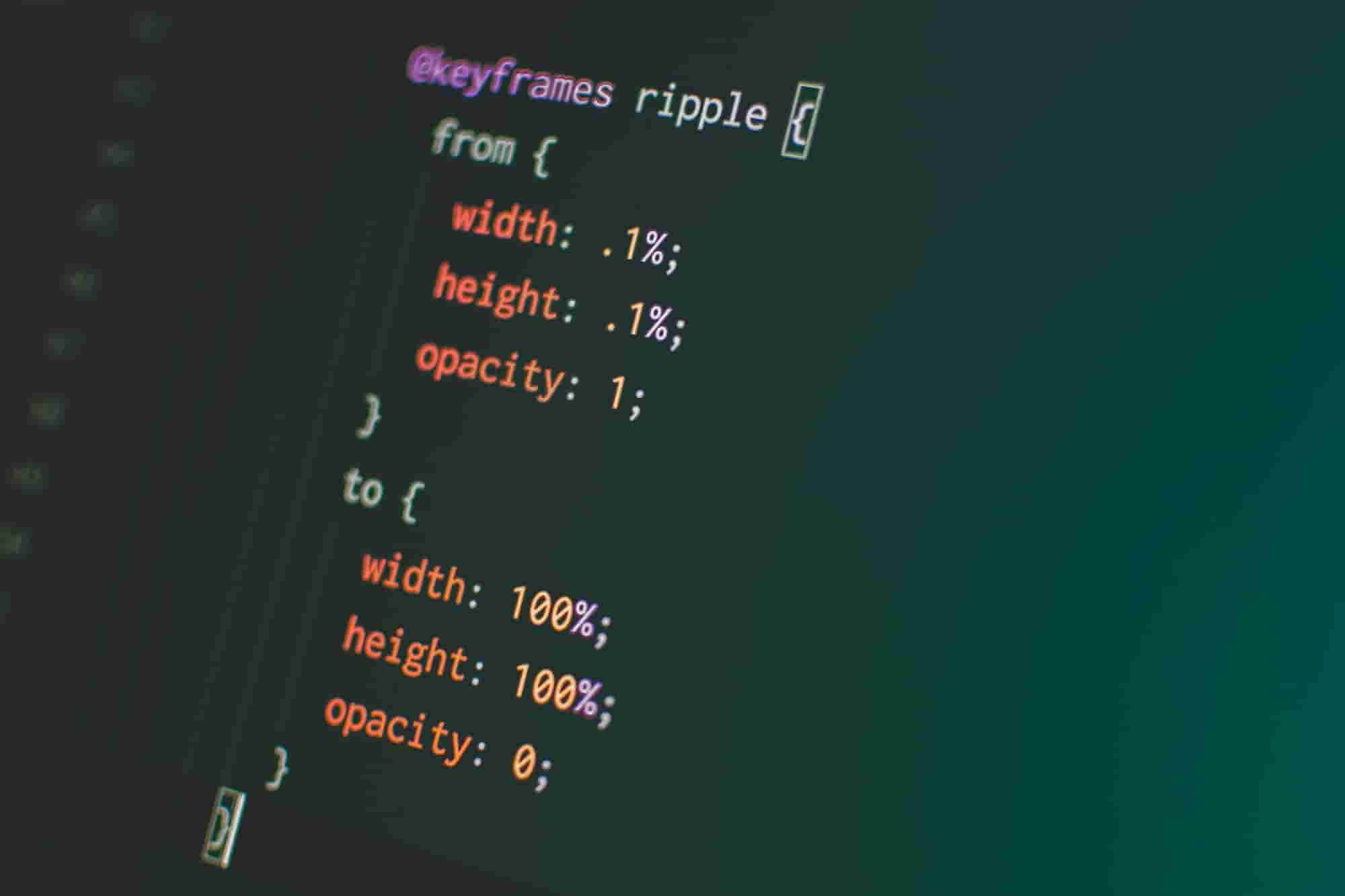
Transitions are used for simple animations as we have seen earlier. For complex animations, CSS3 provides an animation property. It uses a special keyframe property which can be used to control the changes over time as a set of keyframe values.
For animation in CSS, two properties are mandatory.
animation-name: name of the animation which holds the keyframe values for the effect.
animation-duration: how long should the animation last

To know more about other animation properties that are optional, please refer to this link.
Box Sizing
CSS revolves around the box model and it is fundamental that every web developer should know. But for a long time, the formatting of elements based on their width, height, border, and padding has been painful. Especially when it comes to multiple column layouts when the structure of the page collapses when an element size increases or when the content.
CSS3 has come up with a solution that can solve this problem and it is the box-sizing property. The box-sizing property determines how the height and width of an element need to be calculated. It can take two values: content-box and border-box.

Flexbox
Earlier in CSS, width and height were mostly represented as percentages (not as pixels), so that they can adjust themselves to various screen sizes. In CSS3, this is made simple using the display: flex property.
The flex property aligns all the elements that are inside the parent container in a row format and gives them an equal width, if no width is specified, for individual elements. This helps in making the elements responsive.

To know more about the flexbox, please check out this page.
Media Queries
Responsive Web Design (RWD) is an important concept that every web developer should know. It helps in formatting a webpage with respect to the screen size (mobiles, laptops, desktops, etc.).
CSS3 enables a new feature called media queries that supports RWD. It is used to specify different CSS for different screen sizes. This makes sure that the CSS gets applied only when the webpage is viewed in a specific screen size. Let’s look at an example.
Media queries must start with a @media attribute, followed by a media type and finally media expression. So, a normal media query looks like :
//Syntax
@media not | only mediatype and (expressions) { /*your CSS code */ }

//Example
@media only screen and (min-width: 768px) { color : red }
mediatype is optional and will take “all” as default. To know all the possible media type values, have a look here.
Expressions can be min-width or max-width. You can specify your own pixels or you can also follow a standard set of rules that is applicable for different screen sizes like below.
Extra small devices (phones, 600px and below) */
@media only screen and (max-width: 600px) { /* your CSS */  }
/* Small devices (portrait tablets and large phones, 600px and above) */
@media only screen and (min-width: 600px) { /* your CSS */ }
/* Medium devices (landscape tablets, 768px and above) */
@media only screen and (min-width: 768px) { /* your CSS */ }
/* Large devices (laptops/desktops, 992px and above) */
@media only screen and (min-width: 992px) { /* your CSS */ }
/* Extra large devices (large laptops and desktops, 1200px and above) */
@media only screen and (min-width: 1200px) { /* your CSS */ }
Conclusion
The article concludes here, but not your learning. Always be hungry for learning and also make sure to check out the links that I have mentioned above to have a thorough understanding of each of those properties.
Thanks for reading till the end. I hope you learned something today. Also, feel free to comment on your most used CSS3 feature (obviously the media query). Signing off for now.
Arigato Gozaimasu 😀
