Not a day goes by for me without writing at least a single line of CSS. I have written more than 100,000 lines of CSS. This includes both crappy CSS which I’m not proud of and also some cleaner CSS which are obviously taken from Stack Overflow or CSS-Tricks . (Just Kidding. But am I?)
By the time of writing this article, the latest version that we are using is CSS3. It certainly is a major improvement providing lots of features like animations, box-sizing, media queries and the function “calc()” which can be used to perform arithmetic calculations 😯. This is a proof that we will be seeing a lot more features in the upcoming versions.
Let’s look some of the ways CSS can be written that is supported across browsers and also that we are proud of.
Do not use floats for column layouts
The float property has been around for a long time and it serves its purpose very well. Even though it has a lot of use-cases, there are some cases where this can be replaced by something else.
Let us take a simple 3 column layout like this:

The HTML for this is:

For CSS, one way to achieve this result is by using the float property on each element and specifying their width’s separately (not recommended).

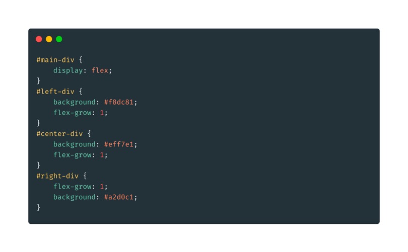
Another way is by using the CSS flexbox flex property on the parent element and flex-grow property on the child elements.

The latter method is easy to read and is also supported by all major browsers including IE-11.
Use variables for colors and fonts
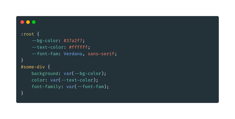
A good website depends on two factors: colors and fonts. It can either make your website beautiful or break them if not used properly. When using different colors and fonts, we often tend to reuse them in many places. This can be avoided by creating a variable using the CSS3 variables.

This helps in code reusability and for any changes in the future, only the variable value needs to be changed.
Use Shorthand properties wherever possible
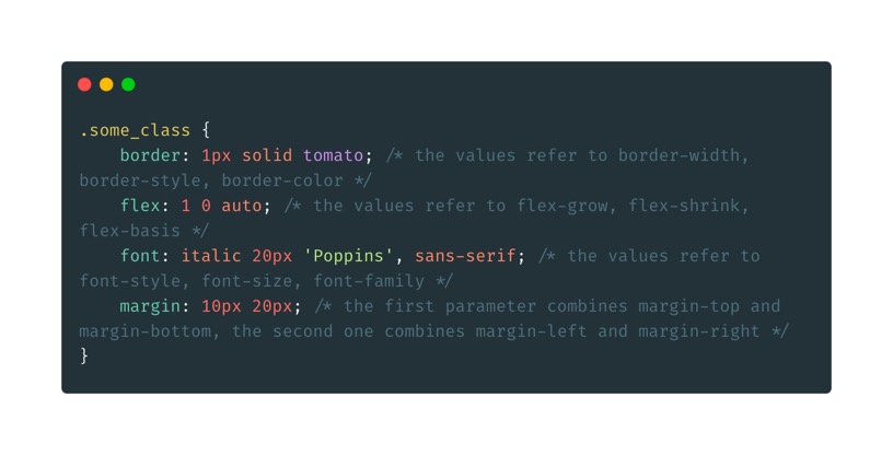
Shorthand properties save a considerable amount of time while writing code and can also help reduce the number of lines of code. But it becomes an overkill if you use it very often. Some example for shorthand properties are:

Group selectors which share similar CSS properties
When our application grows big and we have to add a lot of elements, we often reuse same CSS in multiple places. The more we do it, the harder it becomes for us to make changes in the future.
To avoid this, we should group selectors which share similar CSS properties and declare them at the top of the stylesheet.

Use class selectors rather than element selectors
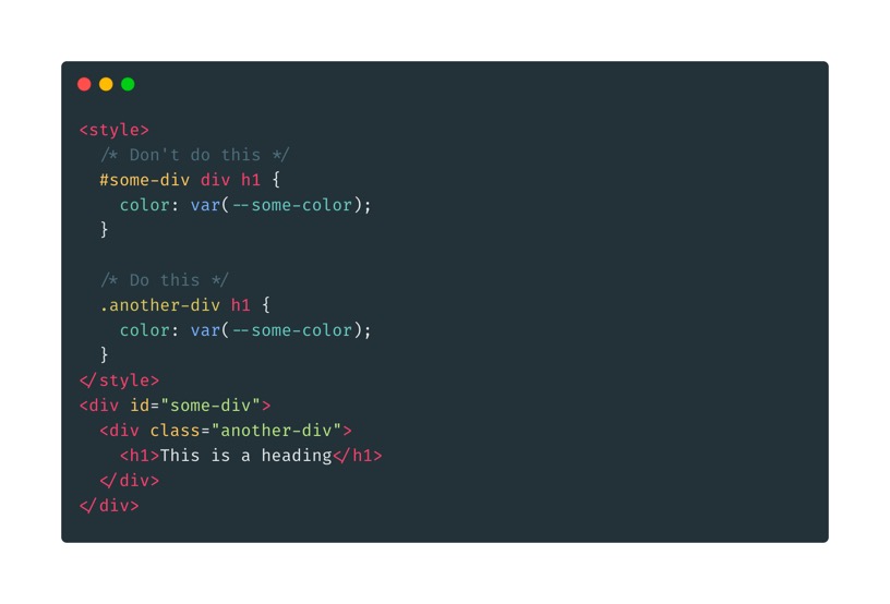
Class selectors are used for reusability. So, when you are writing CSS for an element, first define a class selector and then write CSS for it.

Add comments for complex codes
A code once written should be understandable even if it is revisited sometime in the future.
Literally any developer
And to make that possible, always add comments when you know that a particular piece of code is hard to understand if someone else looks into it.
While following these things makes us write better and cleaner CSS, it’s not easy to follow them all the time. Especially when working on bigger projects which already has thousands of lines of CSS that hasn’t followed these rules.
But as a developer, it’s our job to write cleaner CSS that can be understood by future developers so that they can follow the same.
Hope you like what you have read and if yes, show your love by clapping to the post. Please do consider reading my other article where I’ll be explaining the various features introduced in CSS3 . Also, feel free to share your thoughts on the comments on how we can write better CSS that we can be proud of.
Signing off for now.
Arigato Gozaimasu 😃

Nice read, I like to include the point, using relative units like `em` and `rem`s for super flexibility and responsive,which adjust the element’s properties in relation to font-size.
Thanks Aashiq.. That’s a very useful suggestion.
If there is only one thing I could pick from this list .
It would be FLEX INSTEAD OF FLOAT. As someone who learnt layouts using flex as a starting point , makes me cry : ( whenever I see float based layouts.Forces new devs to learn these concepts just for backward compatibility . floats and clear fixes have had their time .
Floats do create weird problems if not handled well. But they have their own purposes. Flex layout was created mainly for responsiveness, whereas float is similar to the absolute position. I loved float when I started learning CSS and still do, but not as much as I did before 🙂